Reading a Street Sign on a Rainy Walk
Reading a street sign on a rainy walk shows how reflections, sign placement, and nearby street features shape what catches your eye as you pass.
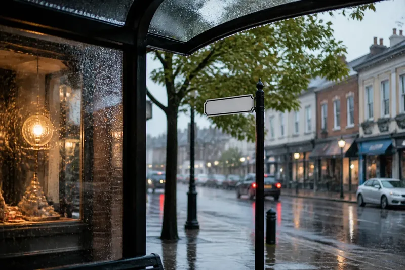
A bus shelter roof ticks with rain as a street-name sign appears beyond it, briefly framed by a shop window. Reading a street sign on a rainy walk means noticing how a small piece of civic infrastructure sits within the larger streetscape, and how the view changes as you move along the sidewalk.
This is a way to read a public place, not to inspect a sign or judge whether it meets a rule. Stay on an accessible route and observe from where you naturally walk. Rain supplies enough moving parts without requiring a special expedition.
Read the sign as part of the streetscape
Start with the sign’s relationship to nearby street features: a tree, building corner, lamp post, bus shelter, or storefront. Is the sign visible against open sky, set beside a doorway, or partly overlapped by branches? Describe the placement you can see rather than deciding whether it is right or wrong.
Notice the order in which details enter your view. You might see the post first, then the sign’s edge, then its lettering. A hood, umbrella, parked vehicle, or shelter panel may change that sequence. A short note such as “shelter roof, sign edge, lettering” records the view without turning a walk into a formal assessment.
Keep your position comfortable. Do not step into a roadway, lean around a barrier, or stop where you block other sidewalk users to improve your view. An incomplete glimpse is still a description of how the sign appears from that point.
Notice how rain changes contrast
Contrast is what helps the sign’s face, lettering, or outline stand apart from nearby surfaces. A dark face may read clearly against a pale wall; a light panel may separate from wet tree branches. On an overcast day, brightness differences can matter more to the view than the exact colors.
Rain can add reflections to glossy panels, darken pavement, and make windows or puddles catch the eye. The sign might remain easy to pick out while its lettering becomes less distinct, or its outline may stand out while the face seems to merge with the background. Note which part you notice first and whether that changes as you pass.
It also helps to distinguish the sign from its support. A narrow pole may disappear against a fence even while the panel is clear, or the post may stand out against a wall while the face blends in. Naming the visible part keeps the observation useful to anyone thinking about how street furniture fits into a public-space view.
Describe competing features, not a messy view
Nearby objects can overlap the sign, repeat its shapes, or draw the eye without covering it. A branch may cross the outline; several poles may make the support harder to pick out; a bright shop display may attract attention from beside the sign. These are different relationships, so “messy” says less than a specific description.
Look at the sign, the nearest object, and then the background without changing your position. Does your attention return to the sign easily, or does a window, banner, or line of vehicle roofs keep pulling it away? This is a small exercise in reading the streetscape, not a claim about the design’s quality.
Useful notes identify the relationship and its location: “branch crosses upper edge,” “bright display beside panel,” or “two similar posts in the same view.”
Track the view as you pass
A sign’s appearance changes along a route. Approached from the front, its lettering may be visible; beside it, the panel turns oblique; after the corner, it may appear against a different building or a patch of sky. Rain adds reflections and moving highlights, so a single glance rarely describes the whole encounter.
Say you are walking toward a neighborhood street-name sign at a corner. At the starting point, its pale face sits in front of leafy branches and the edge is hard to separate. As you continue to the corner, the lettering becomes clearer but the panel turns away; after you pass, the sign appears against a dark storefront and its outline is easier to distinguish. A concise note could read: “Branches behind face on approach; lettering clearer at corner; stronger outline against storefront looking back.” The note describes the changing view, not the sign’s compliance or intent.
If you want to keep a record, write a few words in a phone note after you stop somewhere convenient, or sketch the scene later. Avoid capturing people or private interiors simply to document a sign. The useful record is the relationship between the sign and the public setting, not an accidental collection of images.
What should I notice on a rainy street walk?
Should I record the exact wording?
Record it only if the wording matters to your observation. A location cue such as “street-name sign beside the corner shop” is usually enough when the subject is visibility and placement.
Does rain make a sign easier to see?
It can make one feature clearer and another harder to distinguish. Note the visible change, such as a reflection on the panel or a darker background that separates its outline.
Is it useful to compare signs along one route?
Yes, if you compare what is visible rather than judging which sign is better. One may sit against open sky while another appears among storefronts, or one may face you while another is seen from the side.
What if I cannot make out the sign?
Record what interrupts the view, such as a branch, umbrella, or reflection, and leave uncertain details unresolved. You do not need to move closer or guess at the lettering.
Use a short field note to keep observations precise
A compact note can cover four things: position, contrast, nearby features, and any change while passing. Each prompt helps separate what you saw from what you might be tempted to infer.
- Check what the sign sits beside, such as a doorway or shelter; if the landmark is clear, use it in the note, and if not, describe the nearest visible edge instead.
- Check whether the panel, lettering, or post stands out; if one part is distinct, name that part, and if none is, describe the surface it blends into.
- Check whether a branch, banner, or other feature overlaps the sign; if it does, name the overlap, and if it does not, note the closest competing object that draws attention.
- Check whether a reflection or wet surface changes the view; if a reflection is visible, describe where it falls, and if the cause is unclear, write “possible reflection” rather than guessing.
- Check whether the view changes as you pass; if it does, record the point where the panel or background changes, and if it does not, keep the note to the initial view.
- Check whether your observation can be made from the normal walking route; if it can, continue from there, and if it would require stepping into traffic or blocking someone, leave that view unrecorded.
Imagine you notice a rectangular sign beside a bus shelter. The starting view shows a clear border against the shelter glass, while a bright advertisement sits close by and catches your eye first. You note “border visible against glass; advertisement draws attention first.” The resulting record distinguishes the sign’s outline from the competing feature without claiming that the sign is poorly designed.
Use the same care when a detail is ambiguous. A dark shape may be a branch or a reflection; a panel may be wet or simply glossy. “Possible reflection near the lower edge” is a better field note than a confident explanation from a moving viewpoint.
Keep the walk ordinary
Reading a street sign on a rainy walk works best when it fits into a trip you were already taking. Choose one sign, notice its relationship to the sidewalk, nearby buildings, and other street features, then carry on. The background may change more than the sign, which is a modest reminder that public-space design is experienced as a scene, not as an isolated object.
Rain is not a rating system. It is a temporary layer of reflections, darkened surfaces, hoods, and shifting light. Describe what your eye encounters from your usual route; if the view remains uncertain, that uncertainty belongs in the note too.